Easy to Use Plot Library for Python
What Are the Best Python Plotting Libraries?
Let's dive into the various tools available to Python programmers for visualizing data

Python is a fantastic language for working with data. Libraries like Numpy, Pandas, and Scikit-Learn make it one of the most capable options when it comes to data science. One of the most important aspects of working with data is being able to visualize it. Whether it be for exploratory analysis or sharing findings with the public, creating effective visualizations is something Python programmers find themselves doing often.
In true Python fashion, there are a plethora of options when it comes to choosing a library for plotting. There are relatively simple options, like Matplotlib, and there are more complex libraries, like Folium, that leverage the power of JavaScript to create truly stunning interactive maps. Choosing a library ultimately depends on the type of data and the goals for the plot. Whether you are an engineer analyzing data from an experiment or a researcher presenting your findings at a conference, Python has the tools to create the right visualization for you. In this post, I will discuss some of the best plotting libraries for various circumstances.
The Data
It's much more interesting to compare plotting libraries by using them to explore real data, so in this post, we will be looking at how the living arrangements of 25 to 34-year-olds in the United States have changed between 1967 and 2021. This age group is particularly interesting since it covers the years when young adults are generally finished with college and moving on to the next phase of their lives.
This data is available from the United States Census Bureau, and we can easily download an excel file containing the age group we want to analyze. Once we've downloaded the right file, we can read it into pandas and clean it up a little.
When it comes to reading Excel files rather than .csv files there is often a little more work to be done to get to a nice pandas DataFrame that is ready to be worked with. When I read in the file I can tell pandas which rows are to be used as my headers and how many rows of actual data there are following those headers. This lets us toss out the extra information that isn't part of our actual table.
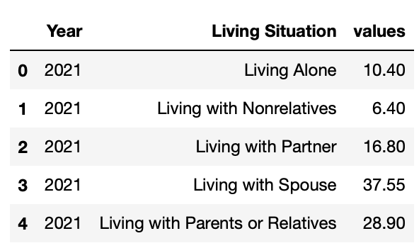
Renaming the columns now allows us to clean up any "Unnamed" cells along with making our lives easier when it comes to creating legends later on. Finally, we can set Year as the DataFrame's index and we get this:
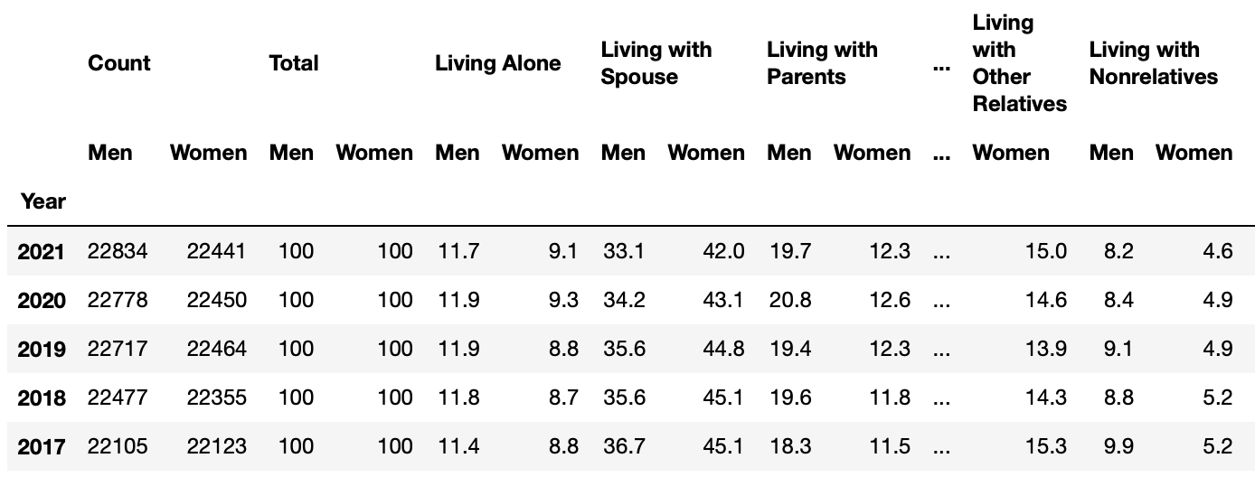
The data is separated by gender by default, though for this post we really just want to take a look at the living arrangements of 25 to 34-year-olds in general.
While we could create these combined columns in our original DataFrame, creating a new DataFrame with only our desired information can make plotting much simpler.
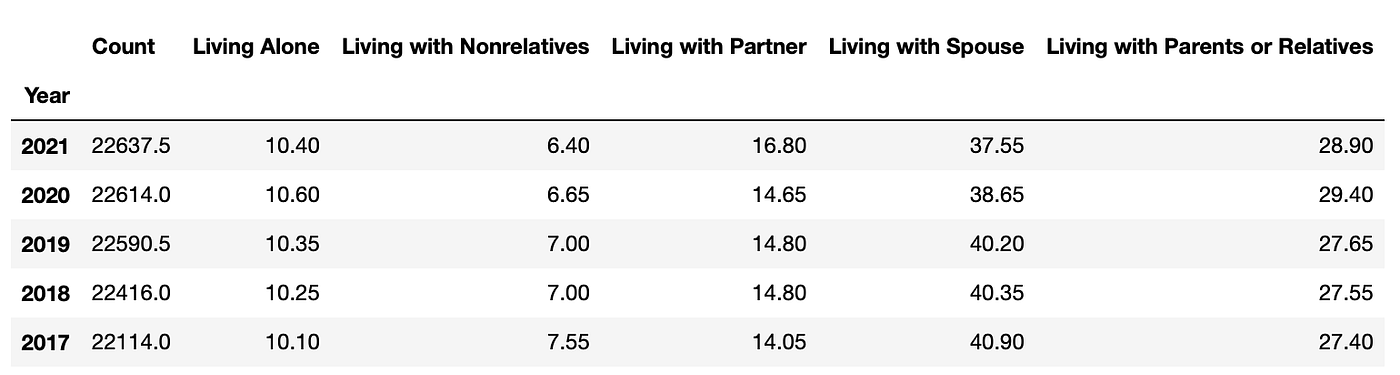
I also went ahead and combined the "Living with Parents" and "Living with Relatives" columns together since they are very similar living situations, which makes our DataFrame more manageable. Now that we have our data loaded into Python, let's start making some plots!
Native Python
The first libraries we'll discuss are Matplotlib and Seaborn. Both are extremely capable and offer a ton of customization for people to fine-tune visualizations to suit their vision. While Seaborn and Matplotlib are similar in many ways, I find that I use them in very different circumstances. Let's discuss the differences and start digging into our dataset.
Matplotlib
Matplotlib is based on Matlab's plot() function, which makes it feel very familiar to engineers who have used Matlab in the past. Other than syntax differences, Matplotlib can create basically any plot that can be created in Matlab. While the core functions of Matplotlib are designed for creating 2-D plots, there are libraries like mplot3d and cartopy available to add 3-D plots and even geographic visualizations to Matplotlib's functionality.
When it comes to exploratory data analysis, I find Matplotlib to be the library I use most frequently. It is straightforward and very easy to use once you get a handle on the basic syntax.
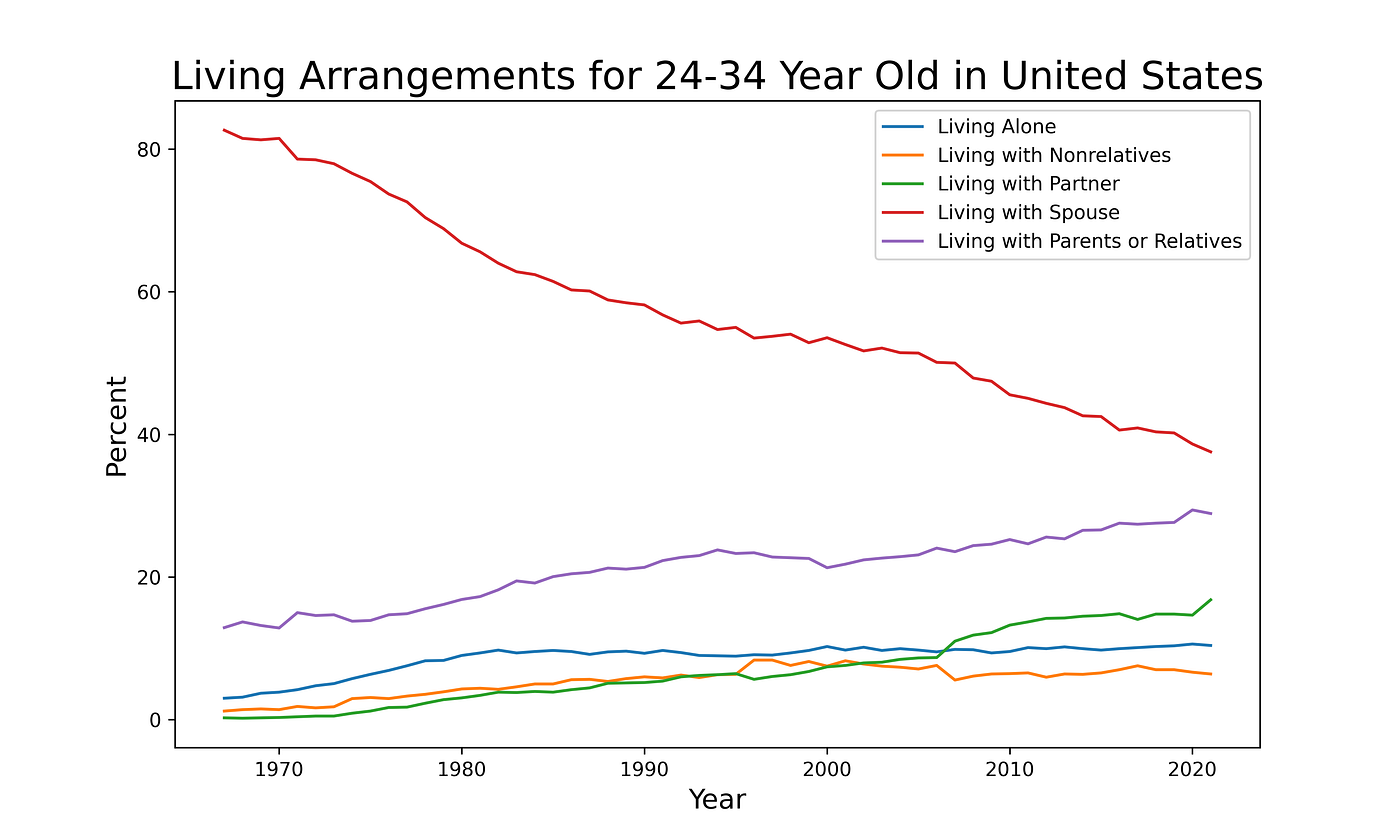
Matlab excels at creating simple and effective plots with minimal effort. It also happens to be extremely customizable, and with varying degrees of effort, you can do all kinds of things with your plots. This is why I often use Matplotlib to create plots for presentations. During a presentation you want the audience to be able to interpret a plot quickly and without much help from you. This allows you to focus on the discussion that the data facilitates. We'll see examples of how Matplotlib plots can be further customized in the Seaborn section next.
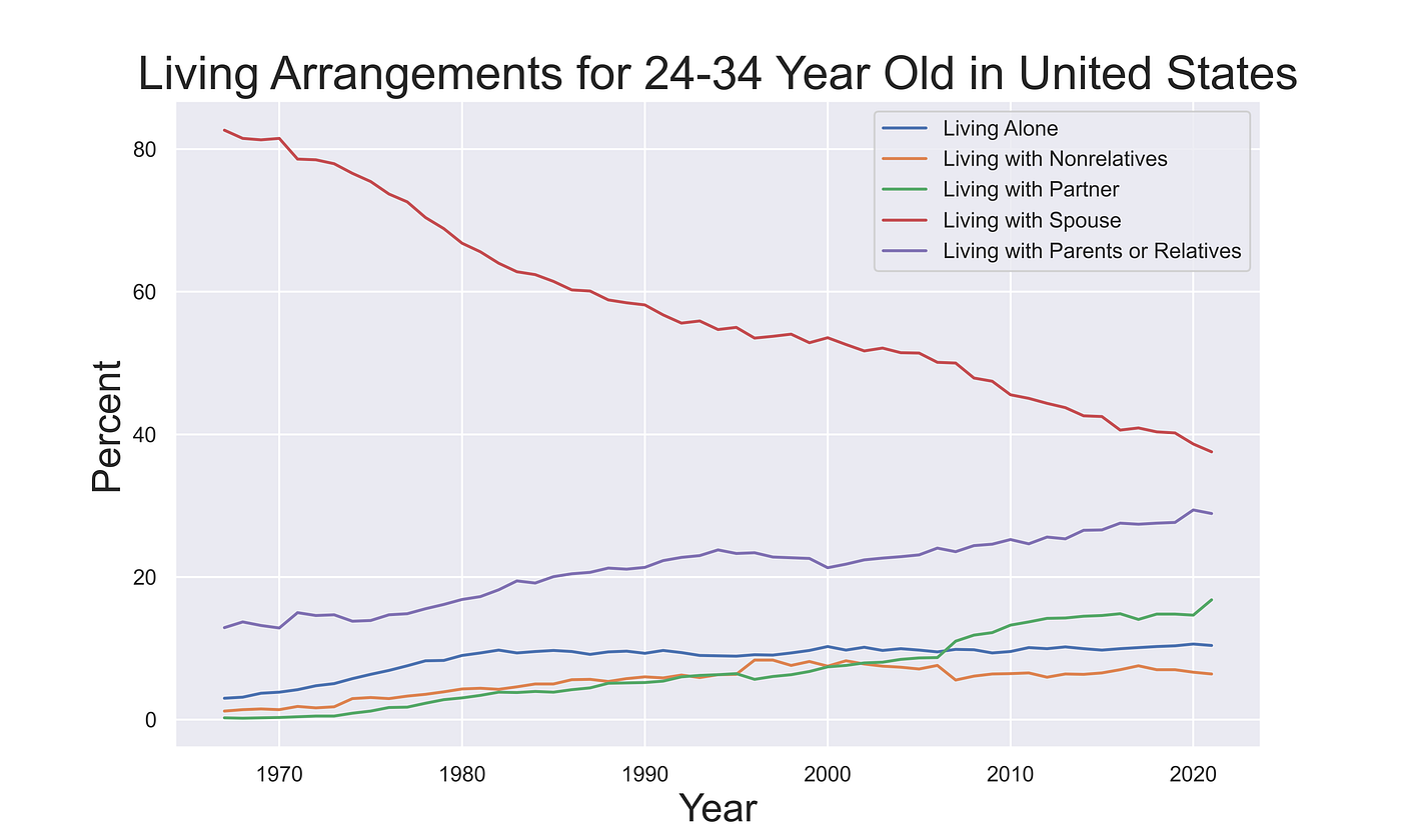
Seaborn
Seaborn is one of my favorite Python libraries. It is a plotting library built on Matplotlib with many easy-to-use styles to help make your plots look nicer out of the box. However, Seaborn isn't just about style; Seaborn's real power lies with its functionality for creating more-complex statistical plots with minimal code, which we'll get to soon.
Since Seaborn is built on top of Matplotlib, we can make use of functionality from both libraries as we can see here:
Melting Data
Seaborn is geared towards plotting data from pandas DataFrames, and there are some neat tricks that make plotting with DataFrames easier. In order to avoid having to create a line for each column of the dataset explicitly, we can re-organize our DataFrame with a process called "melting". Melting is a way of tidying up our DataFrame so that we have a column indicating the category of each value, like this:
Now our data is organized in a way that is much easier to pass into a plotting function since we have a column for our x,y, and category values. This allows us to more easily access the figure object to add more customization to our plots.
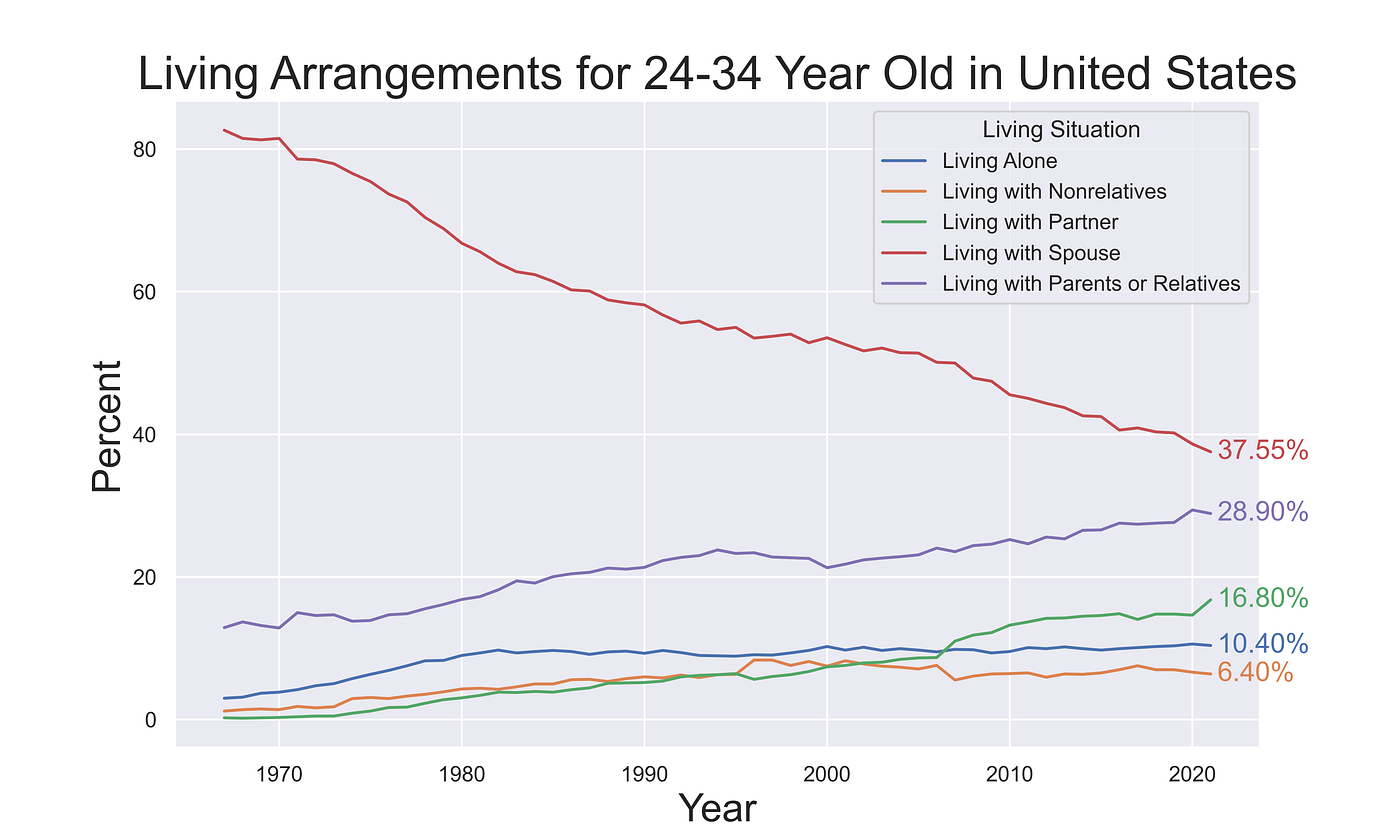
Seaborn's hue argument can be extremely useful. It can be used in many situations to group a numerical column by a categorical column, which makes exploring datasets much easier. Using the hue argument allows us to create our plot with a single line of code, and Seaborn uses the hue categories to separate the data for us.
Being able to create our plot in one line and store the object in ax makes manipulating the plot much simpler. Now I can find the end of each line and annotate the final percentages on the plot itself. Little touches like this can come in handy when creating plots for presentations and other situations where gleaning quick information is imperative. They also can help set the plot apart from every other visualization made using the default tools available to everyone.
Changing It Up
The hue argument makes all kinds of plots easier to make when we have groups to compare with each other. Let's try to take this data and make a bar chart showing how the distribution of living arrangements changed each decade. We have to wrangle the data a little bit to take the mean of each decade.
Starting with our non-melted DataFrame, we can convert the index to datetime and then use a groupby() to average each decade. Then we can melt it exactly as we did before, and now we're ready to create our plot!
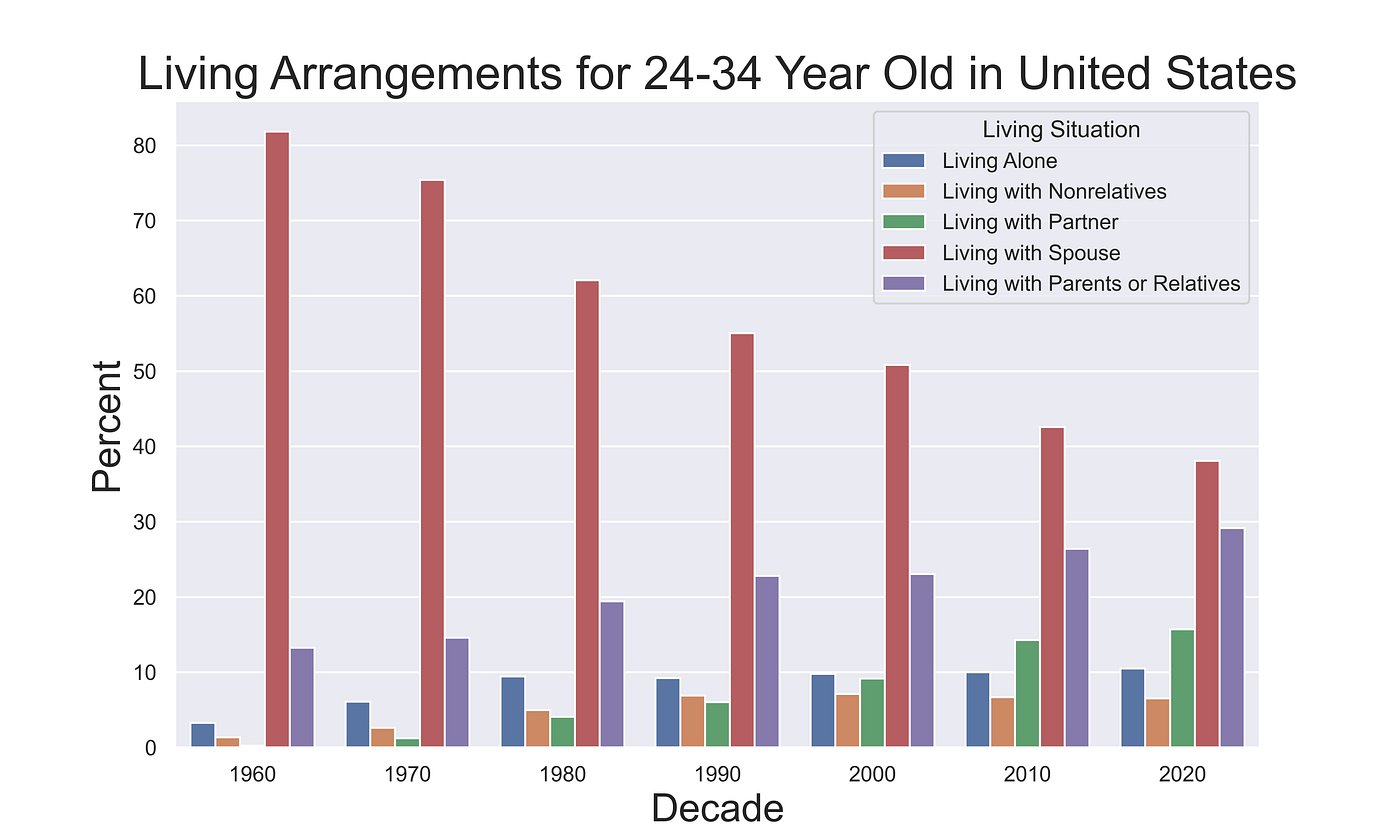
I don't generally use bar charts for time series data like this, but this is a good example of how easy Seaborn can be to use when working with categorical data.
Javascript Wrappers
While Python is absolutely capable of creating fantastic plots using native libraries like Seaborn or Matplotlib, it can't produce the kind of interactive and easily shareable plots that JavaScript can. Interactive plots are especially useful when we are sharing visualizations online because they allow the viewer to explore the data and glean more information than a static plot can provide. On a webpage where a user has ample time to explore your work, an interactive visualization can be more engaging and impressive than its static counterpart.
Plotly
Plotly is a library that brings the power of interactive plotting with JavaScript to languages like Python and R. It is built with JavaScript and takes advantage of the powerful D3.js library. Using Plotly, we can create interactive plots in Python with only a few lines of code. You will notice that I am still using the melted DataFrame that we created for the Seaborn plots; many plotting libraries in JavaScript also prefer this tidy data format since it allows for data to be easily parsed into categories.
Using the Plotly Express library we can quickly recreate our living arrangements plot. Medium doesn't support embedding JavaScript directly, so I had to upload it to a service called DataPane. Normally you won't need to mess with this middleman service since Plotly can host plots you create using their Chart Studio service.
One of the features I really like about Plotly line plots is the ability to click on a line in the legend to toggle it on and off. For more complex plots with many lines, this can be a super useful feature that allows you to create more complex plots and encourage readers to interact with the data.
Folium
Folium is an excellent Python library that combines Python's data wrangling capabilities with leaflet.js to create a powerful mapping tool. While we aren't working with spatial data in this post, I wanted to mention it in this category of Python libraries that take advantage of JavaScript.
What About Just Using JavaScript?
JavaScript is one of the most capable programming languages for creating interactive data visualizations. Libraries like D3 and Leaflet allow for extreme customization and can be used to create very unique plots. However, this flexibility comes at the cost of requiring more code and time. Even creating a simple interactive line plot using D3.js takes significantly more time than using Plotly's Python library.
Due to the much steeper learning curve and time commitment needed to create plots using JavaScript, I really only recommend it for three cases: times when you want to be creative, you are working with large geospatial datasets, or you are creating a unique data dashboard.
If you are publishing something like a research paper and you really want your plots to stand out, JavaScript is by far the best tool to use. This is especially true for web developers that want to create unique data visualizations that aren't bound by the traditional rectangles that most plots exist within. Using D3 a web developer can turn a page of information into an interactive experience, where data and design can co-exist.
Geographic visualizations are the reason I originally learned JavaScript. I work with a lot of geospatial datasets, and visualizing data on a map is critical to showing others my findings. Python has a few tools for creating these kinds of plots, however, they are all quite limited and ultimately require JavaScript wrappers to achieve any satisfying results. JavaScript has some incredible libraries like Mapbox and Leaflet for creating geographic visualizations, and if you work with geo data often I highly recommend learning how to use them.
Note: If you are enjoying reading my and others' content here on Medium, consider subscribing using the link below to support the creation of content like this and unlock unlimited stories!
Resources
- Seaborn Tips and Tricks
- Upload and Embed Interactive Plotly Visualisations
- 2000 Cool D3.js Plots
Documentation
- Matplotlib Docs
- Seaborn Docs
- Plotly Python Docs
- Datapane Docs
Data Source
[1] U.S. Census Bureau, Current Population Survey, Annual Social and Economic Supplement, 1967 to present, Historical Living Arrangements of Adults (2021)
- Link to Data's Download Webpage
- All U.S. Census Bureau data is public domain, the license can be viewed here
Source: https://towardsdatascience.com/what-are-the-best-python-plotting-libraries-df234a356aec
0 Response to "Easy to Use Plot Library for Python"
Postar um comentário